
Great Figures to Communicate Your Science
Figures are often the first part of a paper that readers examine, making them essential for communicating scientific results clearly to diverse audiences. Well-designed figures should communicate a clear scientific message, reinforce the narrative of the paper, and make the key findings immediately apparent. The guidance below summarises practices we generally encourage in the TESS Lab. It is not prescriptive, as conventions vary between journals.
Figure Captions
A figure is incomplete without a clear, informative caption. Captions should be sufficiently self-contained that readers can understand the figure without repeatedly referring to the main text. An effective caption typically includes:
- Figure number. Begin with Figure followed by the figure number and a colon (e.g., Figure 1:). Number figures in the order they appear in the text. In longer documents, such as theses, chapter-based numbering is also common (e.g., Figure 3.2:).
- A declarative opening sentence. State the main finding or message of the figure. Rather than simply describing what is plotted (e.g., Relationship between X and Y), summarise what the figure demonstrates (e.g., Productivity increased with rainfall until reaching a plateau at high precipitation).
- Essential supporting information. Include the key methodological details needed to interpret the figure independently, such as sample sizes, statistical tests, significance levels, definitions of symbols or abbreviations, and explanations of summary statistics where appropriate.
Why we recommend declarative captions
Figures are frequently viewed before, or independently of, the main text. A declarative opening sentence allows readers to understand the figure’s main contribution before examining the supporting evidence. This reader-centred approach:
- Improves comprehension by making the key message immediately clear;
- Encourages authors to design figures that communicate a single, well-defined result; and
- Strengthens the overall narrative by making each figure’s contribution explicit.
A note on interpretation
Declarative captions have sometimes been criticised because traditional figure captions simply described what was plotted (e.g., Scatterplot of X versus Y), leaving readers to draw their own conclusions. We recognise this perspective, but favour a reader-centred approach. Scientific papers already present interpretation throughout the title, abstract and Results, and figures are an integral part of that scientific argument rather than standalone illustrations. A declarative caption therefore does not replace the evidence or preclude alternative interpretations; it simply makes the author’s intended message explicit, helping readers understand why the figure is included and how it contributes to the paper. This approach is increasingly advocated in modern scientific writing guidance because it improves clarity, accessibility and the communication of scientific findings ([1], [2], [3], [4]).
Tips for Figures
Where possible and appropriate, try to show the data rather than only summary metrics (e.g., a central tendency such as mean or median) in data visualisations. Plots that show all the data allow readers to intuitively grasp the sample size, the extent of variability in each sample and the distribution of this variation.
Take care to ensure that your figures are completely legible at a 100% reproduction size (avoiding tiny text!).
It is important to use an appropriate colour palette to maximise the accessibility and interpretability of our figures. For more information, see viridis vignette and also this blog introducing the turbo palette. An estimated ca. 5% of the global population has some form of colour blindness.
To reduce distortion in global maps, we should use a suitable projection to avoid perpetuating biased and misleading representations of our planet. The ‘Winkel Tripel’ projection is best (required by National Geographic), though the ‘Mollweide’ and ‘Robinson’ projections are also both much better than the (highly distorted) ‘Mercator’ projection that is usually the default in most geospatial software (more info). In R this can usually be achieved with one extra line of code.
Example Figure Captions

Example Figure 1. Point clouds derived from UAV surveys provided structural reconstructions of plants across globally distributed non-forested ecosystems. Our sampling across four continents (A) encompassed five bioclimatic zones where low stature vegetation is often dominant, representing most of the non-forest biomes described by Whitaker (1975) (B). Reconstructed point clouds with grid of black points representing the modelled terrain correspond strongly with photographs of harvest plots (C).
(from Cunliffe et al. 2022).
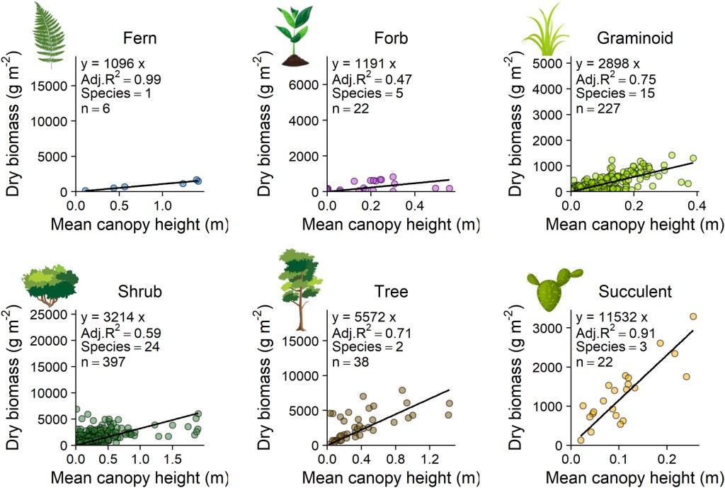
Example Figure 2. Photogrammetrically derived canopy height was a strong predictor of biomass within most plant functional types. A constant X:Y ratio was used for all plots, enabling visual comparisons of model slopes even though axis ranges vary. Model slopes were generally similar within but differed between, plant functional types. ‘Species’ indicates the number of species pooled for each plant functional type and black lines are linear models with intercepts constrained through the origin. Full model results are included in Table 1.
(from Cunliffe et al. 2022).
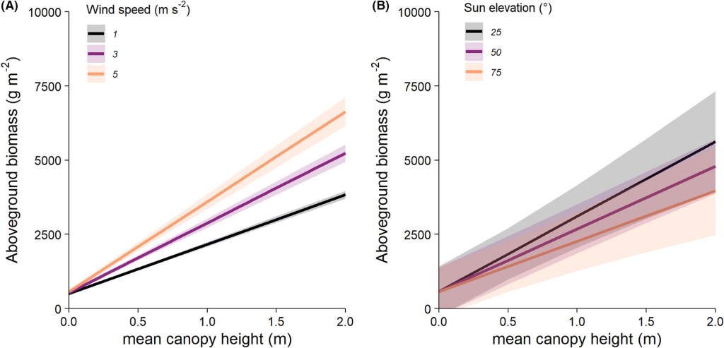
Example Figure 3. Reconstructed plant height and thus height–biomass relationships were systematically influenced by near-ground wind speed but were insensitive to sun elevation. Mean predicted aboveground biomass variation over the range of observed mean canopy height, estimated for a range of three wind speeds and sun elevations. Wind speed had a statistically clear and positive effect on the relationship between height and biomass (A) (Figs. S2A and S3, Table S3) but sun elevation had no significant effect on the relationship between height and biomass (B) (Figs. S2B and S5, Table S5). Shaded areas represent 95% confidence intervals on the model predictions.
(from Cunliffe et al. 2022).

Example Figure 4. Aboveground biomass was strongly predicted by canopy height but less strongly by NDVI. For each harvest plot, the mean canopy height was measured with point-intercept (a) and structure-from-motion photogrammetry (b), and mean NDVI was extracted from the 0.119 m grain raster (c). Linear models with constrained intercepts were fitted using least mean squares optimisation, with constrained intercepts for the canopy height models. The linear model fit is a simplification of the likely saturating relationships that we would expect to find across the full variation of NDVI and biomass values.
(From Cunliffe et al. 2020)
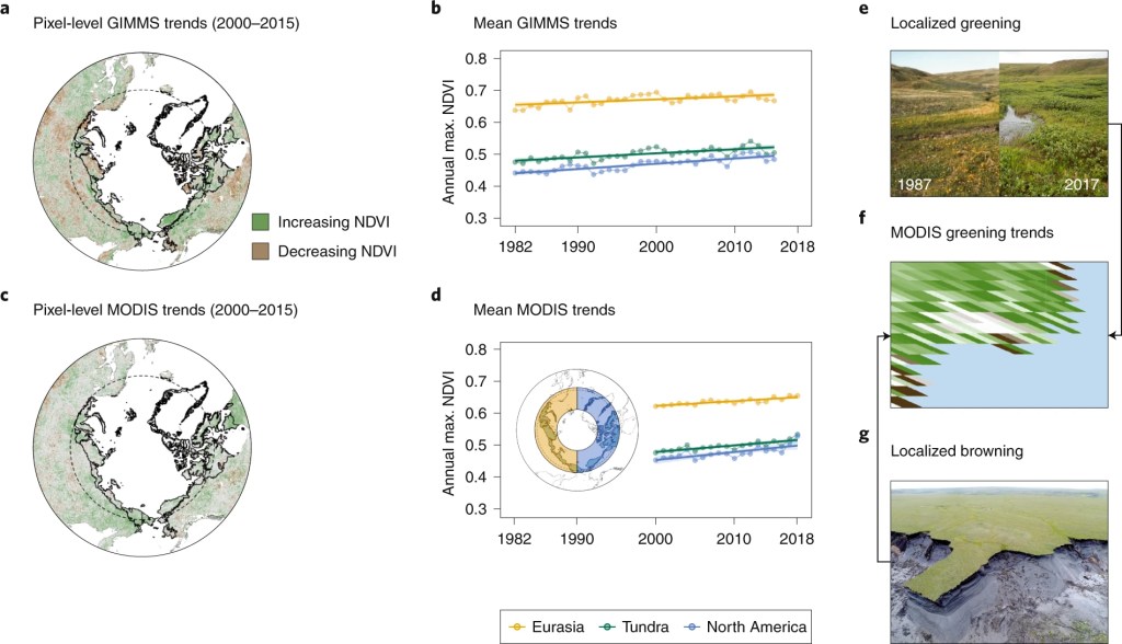
Example Figure 5. Apparent Arctic greening, which varies across space and time and among satellite datasets, is driven both by actual in-situ change and, in part, by challenges of satellite data interpretation and integration. a–d, Trends in maximum NDVI vary spatiotemporally, and the magnitude of changes depends on what satellite imagery is analysed (a and c, data subsetted to temporally overlapping years; b and d, data from the Global Inventory Modeling and Mapping Studies dataset from AVHRR (GIMMS3gv1) 1982 to 2015, and MODIS MOD13A1v6 2000 to 2018). e–g, Regional trends may summarize localized greening, for example shrub encroachment (e) and browning such as permafrost thaw (g) occurring at the pixel scale on Qikiqtaruk–Herschel Island in the Canadian Arctic (f). NDVI trends (a and c) were calculated using robust regression (Theil–Sen estimator) in the Google Earth Engine130. Dashed line indicates the Arctic Circle, and the black outlined polygon (a and c) and green ‘tundra’ line (b and d) indicate the Arctic tundra region from the Circumpolar Arctic Vegetation Map (www.geobotany.uaf.edu/cavm/). The inset map in d indicates the regions for the mean trends for yellow ‘Eurasia’ and blue ‘North America’ polygons.
(From Myers-Smith et al. 2020)

Example Figure 6. (a–d) Temperatures are warming, (e) frost frequency is decreasing, (f) the snow melt data is getting earlier, (g) sea ice concentrations are lower, and (h) soil temperatures are warming on Qikiqtaruk. Changes in climate and environmental data from Qikiqtaruk including air temperatures (a–d; Environment Canada data), frost day frequency (e; the number of days that the mean temperature is below zero, CRU TS3.21 data), snow melt date (f; phenology monitoring), sea ice concentration (g; minimum proportion of ice to open water Canadian Sea Ice Service data for the CIS WA Beaufort Sea: Mackenzie region), and soil temperature at 12, 15, and 16 m depths from two different boreholes (h; soil temperature monitoring data). Three records with outlier values were not included in the models in panel h for the years 2007 and 2012. Air temperature plots show mean values for the months indicated. Trends lines are Bayesian model fits with error of 95% credible intervals. Full model outputs can be found in Appendix S1: Table S2.
(From Myers-Smith et al., 2019)
Check your captions to ensure that elements are in the right place, especailly for information that would be better presented within the figure itself (example below).
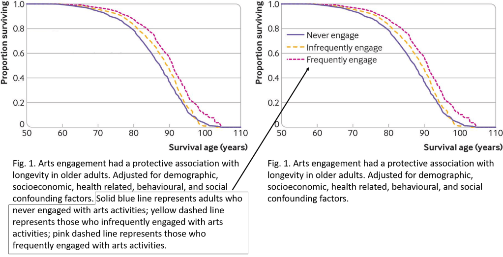
For most scientific outputs, we should position captions under figures (instead of titles within figures). While captions are occasionally placed becide or even above figures, the decision to place captions in uncommon locations should normally only made by the production editor, not by the writer(s).
Table Titles
Table titles should go above the table. Table titles do not contain descriptions but they may include additional necessary information.
Links for further resources
- https://dynamicecology.wordpress.com/2024/03/04/convey-the-key-message-of-your-figure-in-the-first-sentence-of-the-legend/
- https://cran.r-project.org/web/packages/viridis/vignettes/intro-to-viridis.html
- https://erinwrightwriting.com/how-to-write-figure-captions/
- https://writingcenter.unc.edu/tips-and-tools/figures-and-charts/
- https://www.nature.com/articles/s41558-019-0688-1
- https://www.internationalscienceediting.com/how-to-write-a-figure-caption/
- https://www.scu.edu/media/offices/provost/writing-center/resources/Tips-Figure-Captions.pdf
- Kroodsma DE. A quick fix for figure legends and table headings. The Auk. 2000 Oct 1;117(4):1081-3.
 Terrestrial Ecosystem Science & Services